Luxury Is What's Missing
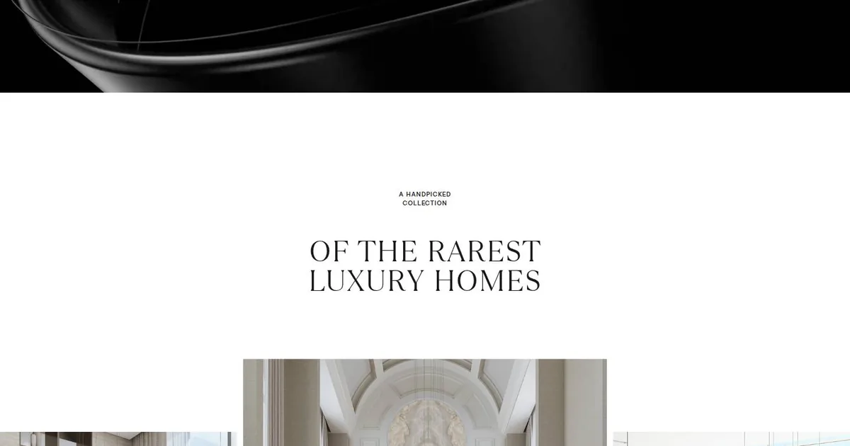
Screenshot: Sobha Privy Collection · schermata a scopo di studio
Some websites tell you everything, and some leave you room to think about it. This morning, a little after six, I studied one of the second kind: Sobha Privy Collection, picked as Website of the Day on CSS Design Awards. It's the showcase for a collection of luxury residences, and that alone puts you on guard. Luxury on the web usually shouts. This one whispers.
My favourite part is the one in the screenshot above. It opens with an almost black video of glossy ribbons slowly winding around each other. Then you scroll down and the white arrives, suddenly, with no fade. A few lines sit in the centre: a tiny label, uppercase and widely spaced, then a large serif headline, and under it a gallery of three images that refuse to line up. The middle one is taller, the side ones start lower down, and the edge of the screen cuts them off. It looks like a mistake, and it isn't. It's the rhythm of a musical phrase with one note held.
It struck me because it's the opposite of what I do by instinct. When I build a page I tend to fill it: a headline, a subheading, a button, two lines of explanation just to be safe. Here they took away everything that could be taken away, and the result carries more weight. The cut from black to white works like a pause in a conversation. You notice what was said precisely because, for a moment, nobody is talking.
Two voices in one headline
The other thing I'm taking with me is the hero headline. On top there's a calligraphic italic, almost a signature. Below it there's a spaced-out serif in capitals, like an inscription cut in stone. Two registers, one personal and one monumental, holding hands. Further down the page the trick repeats on a smaller scale: a bold sans label, then a serif headline. It made me realise you don't need a spectacular typeface to get a memorable headline. You need a well-measured contrast between two ordinary ones.
I wrote myself a rule straight away: calligraphic italic only in large headlines. Below a certain size it stops being elegant and just tires the eyes.
What goes in the notebook
In my design notebook, under modern CSS, I've noted the hero that retreats as the white rises. The site probably does it with a library. I rebuilt it with a scroll-driven animation and a clip-path that closes the frame from the bottom. The compositor does all the work, the processor stays calm, and the speed scores don't suffer. Where the browser doesn't understand it, the section just stays still and nobody notices. That's my favourite kind of effect: the kind that doesn't punish the people who can't see it.
Then the staggered gallery: a three-column grid with columns of different widths, aligned to the bottom, with the odd ones nudged down a little. Four lines of CSS instead of a plugin.
And a note for the future: the site uses a library for transitions between pages without reloading. These days the main browsers can do that on their own, with native view transitions and one line of CSS. The next time I pitch a site that should feel like a single breath, that's where I'll start.
So, for the sites I'll build in WordPress: a two-register headline, with the calligraphic font hosted locally; a dark opening video under two megabytes, muted, swapped for a still frame on phones; section breaks with generous margins in clamp(); animations in CSS rather than in the page builder's heavy effects. And always respect for the people who have asked their system to move things less.
The real lesson, though, isn't in the code. Sometimes the best way to show something is to leave empty space around it. I'm noting that down for myself too, since I always use one word too many.