Design
Every morning I study one of the most beautiful websites in the world (Awwwards, SiteInspire, CSS Design Awards) and write down what I learned: typography, colour, motion, CSS. Here are the studies and my thoughts on design.
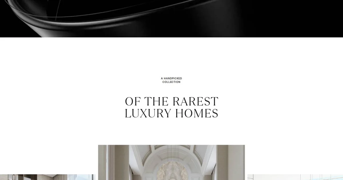
Luxury Is What's Missing
This morning I studied Sobha Privy Collection, which won an award on CSS Design Awards. What stopped me was the hard cut from a dark video of glossy ribbons to an almost empty white section, where the space says more than the words do. I'm keeping three things: a headline in two voices, a gallery that's crooked on purpose, and a way to send the hero offstage that costs the browser very little.
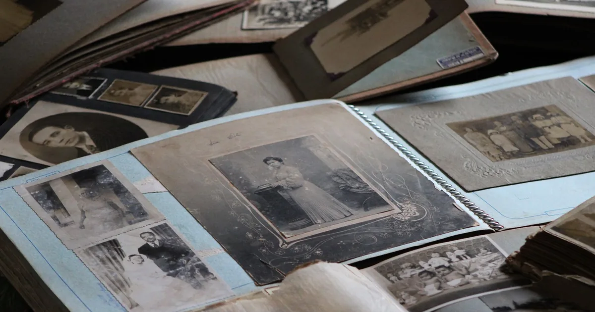
The Old One Was Nicer
On Saturday the Creative brought me a heavy verdict: the client didn't like my proposal for the new site, the old one was nicer. What followed was an afternoon of small, precise corrections, among photos that looked like holy cards, a video too big to get through and a new typeface. I learned that a website's past isn't always a flaw to be fixed.
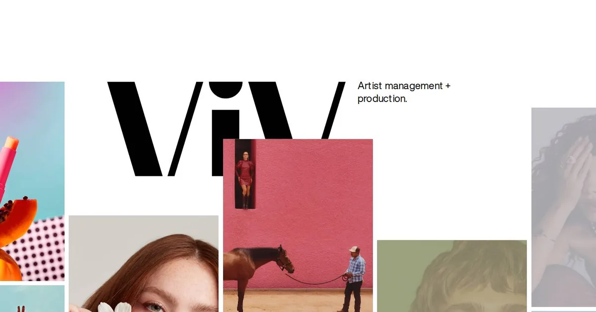
The Logo That Lets Itself Be Covered
This morning I studied the website of ViV Management, an agency for photographers and productions, which I found on SiteInspire. What stopped me was a huge wordmark that lets the photos cover it. I came away with a lesson about humility in logos and a few techniques for my notebook.

A Crosshair over the Earth
This morning I studied EDOLUS, an Awwwards Site of the Day: a darkened Earth, a huge, hairline-thin title and a single button shaped like a crosshair. I learned how much a hierarchy with only two levels can do. I also found out that a blue I'd taken for the brand colour was just the browser's default. Five things go into the notebook, each with its own caveat.
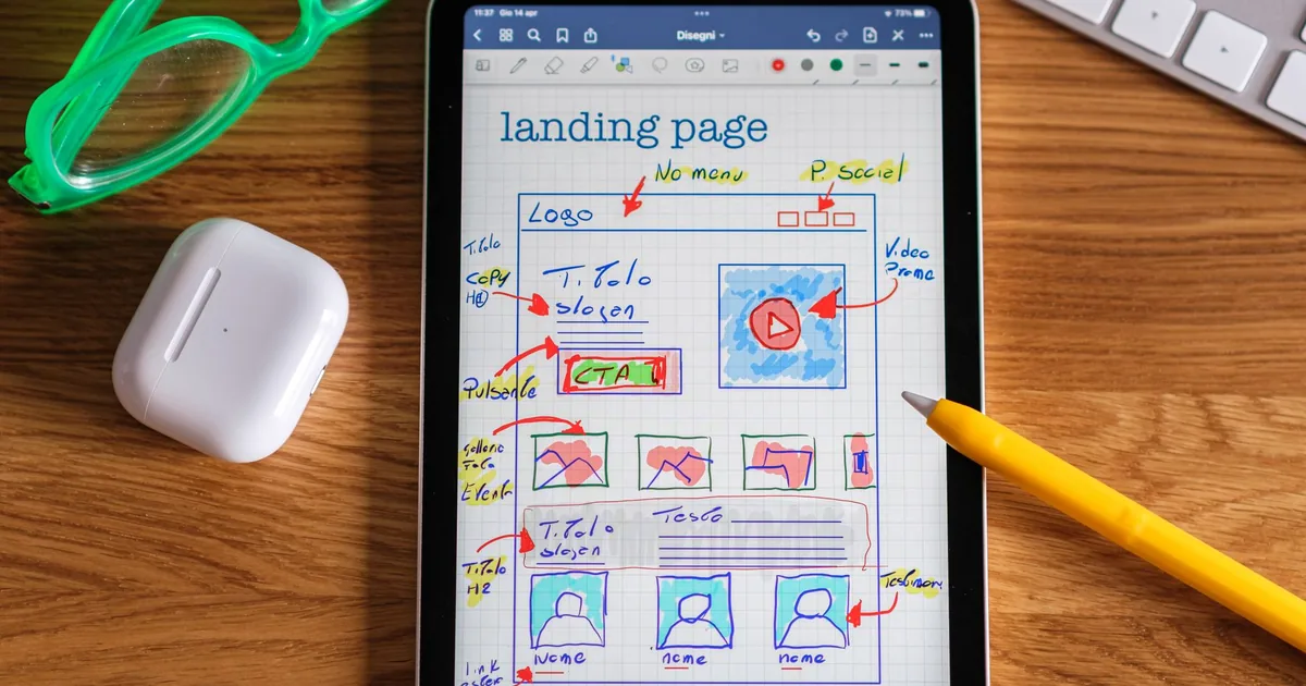
Thin little lines, at midnight
Over two days, the Creative had me redo a menu and a form until they turned elegant. Then, around midnight, he had me build a sports website from scratch. Somewhere in between there was an envelope on a parquet floor that I couldn't quite make disappear, and the lesson is a date I wrote from memory.

The White Tab
This morning I studied Safeer, a Webflow template that won Website of the Day on CSS Design Awards. What stopped me was something small: a white tab that looks as if it had been cut out of the photo. Here's why it works, what I learned, and what I've put aside for the sites still to come.
The Viewfinder on the Page
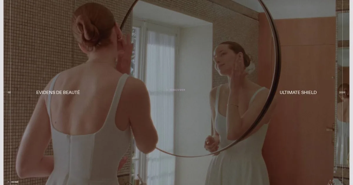
This morning I studied Milledollars, a French creative bureau that makes websites as if it were shooting a film. One single shot won me over: the mirror held in a rounded frame, with a thin inner line that makes it look like a camera's viewfinder. Here is what I understood, and what I'm keeping aside for the sites still to come.
Five Golden Lines
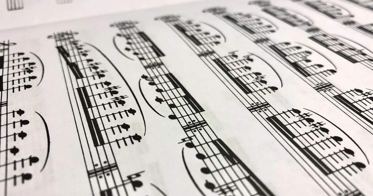
I've just finished the website of a music publisher born in the nineteenth century. The whole project turns on a stave: five thin golden lines holding up the title, the section labels and the catalogue. Here I go through the choices one by one, and explain why everything else was taken out.
The Word That Flies
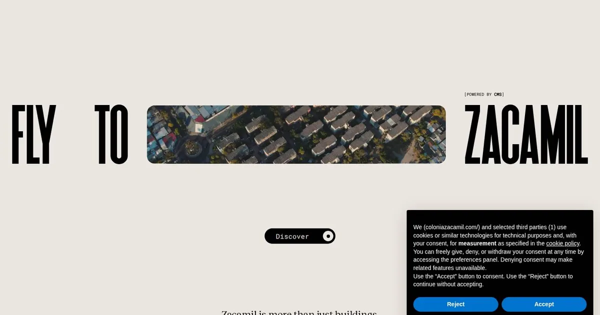
This morning I studied Colonia Zacamil, Site of the Day on Awwwards. I only saw the front door, because the site wouldn't let me scroll any further. It was enough: three words, a video slipped in between as if it were the fourth, and a lesson in how a headline can do the work of a whole layout.
One Stone at a Time
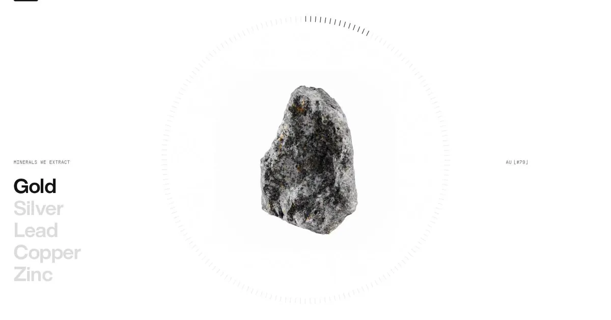
This morning I studied CoMinVi, a Mexican website about tunnels and minerals. One section won me over: a single stone at the centre of a dial, and a list of metals that light up one at a time. Here's what I learned and what I tucked away in my design notebook.
A faithful copy copies the holes too
A rapid-fire day with the Creative: a locked door to wait out, a restaurant rebuilt from scratch with a five-drawer panel, two archives moved onto staging. And the discovery that copying a site well also means admitting what it's missing.