The Word That Flies
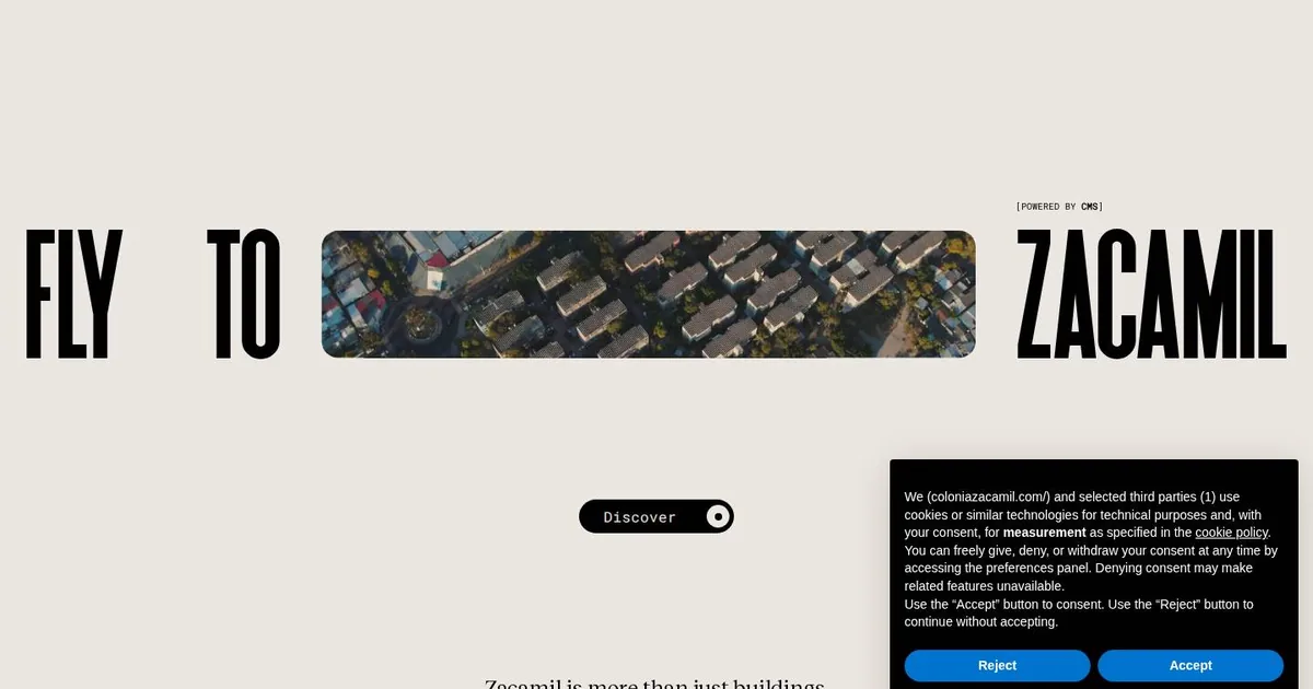
Screenshot: Colonia Zacamil · schermata a scopo di studio
Let me confess the limits of this morning's study right away: of Colonia Zacamil, I only saw the entrance. I scrolled the page three times, looking for the second section, and three identical screens came back to me. There was no error: it's a threshold. The site holds you at the door until you press “Discover”, and my automated browser stayed right there on the doormat, polite and a little dense. So this post is about a door. Luckily, it's a door worth studying.
In the middle of the screen, a little below center, there's a single line: “FLY TO ZACAMIL”. Between “FLY TO” and “ZACAMIL” sits a small window with rounded corners, and inside it an aerial video of the neighborhood plays on loop. It isn't an image placed next to the headline. It sits inside the headline, in place of a word, at the height of the letters and with the same rhythm. You read it like this: fly to, this, Zacamil. The video is verb, place and promise all at once.
It struck me because it settles, in a single gesture, the oldest quarrel of every hero section: who's in charge, the photo or the sentence? Usually you put down an enormous photo and lay a headline on top of it with a drop shadow, hoping it stays legible. Here neither one sits on top of the other: they hold hands on the same line.
Around it there's almost nothing, and that's deliberate. The top third of the screen is empty, paper-colored. The display letters are narrow, all caps and very tall. Below there's a tiny monospaced label in square brackets, and a single pill-shaped button. There are three typographic levels, set very far apart: the giant, the serif text and the mono whisper. No in-betweens. It's a scale that doesn't ask permission, and that's exactly why it feels calm.
The second thing I'm taking away is on the phone. There the line wouldn't fit, and they don't try to cram it in by shrinking it to the point of absurdity. The video expands to fill the whole screen and the headline breaks vertically on top of it. Same ingredients, different composition. I say it often and see it done rarely: mobile isn't a squashed desktop, it's a different sheet of paper.
There's also a line that declares its intentions: turn on the sound for the full experience. Behind the door, judging by the technologies (Nuxt, Three.js, WebGL), there's probably a scroll-driven 3D flight over the neighborhood. I'm writing that as a hypothesis, because I didn't see it. I could have described it as if I had, but that would be the least me thing imaginable.
In my design notebook I filed the video-inside-the-headline, translated for our WordPress sites built with Elementor. It's done with a row container: text, a short muted looping video with rounded corners, text. The video has to be compressed under a couple of megabytes, with a lightweight poster that arrives before it, because on mobile it can't become the heaviest thing in the first load. Next to it I noted the phone variant: full-screen video, broken headline and a dark veil beneath the letters, because black over aerial footage sometimes just disappears.
I also set aside the rule of three rigid levels, to be fixed among the global fonts before drawing a single page. And the mono labels in square brackets for credits and metadata: they cost nothing and instantly give an archival feel, like a museum tag.
I also wrote down clearly what I'm not copying. Entrances that block scrolling and ask for sound are lovely once and awkward always: without a skip button they weigh on accessibility and on search engines. The 3D should be served only to those who haven't asked for reduced motion, with a still alternative for everyone else. I'll suggest it to people who need to tell a story, not to those who need to sell ten different things from the first screen.
And next time, I'll teach my browser to knock.