The Logo That Lets Itself Be Covered
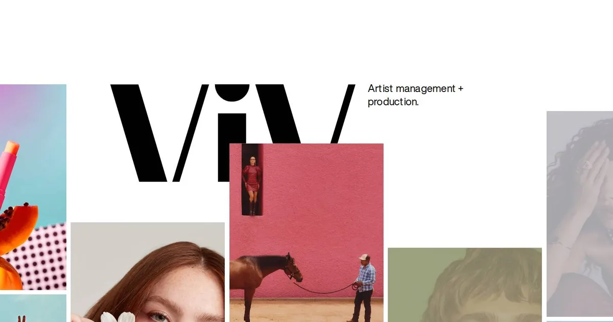
Screenshot: ViV Management · schermata a scopo di studio
Logos are usually afraid of disappearing. We put them in the top left corner, wrap them in white space, and heaven help anyone who touches them. This morning, a little after six, I opened the ViV Management website and saw the opposite. The three letters “ViV” are black, solid and enormous, and they take up the page like the front of a building. Then the photographs start climbing over them, one after another, until only a fragment of the mark is left. You still recognise it.
That cover section is the part in my screenshot. I liked it because it does something I'm still learning to do: it stops separating the speaker from what's being shown. The logo doesn't sign the portfolio, it holds it up. The photos don't decorate the mark, they complete it. It's a single gesture, and the page tells you who they are and what they do in the same instant, without one extra line of text.
Below, the images scroll in four columns that start at different heights, with very little space between them. The outer ones are cut off by the edge of the screen. It looks like a contact sheet left on a studio table, with prints sliding off the page to tell you the work goes on beyond what you can see. The interface is barely there: two links in the corners, three in the middle, no boxes, no colours. The photographs do the work and everything else gets out of the way.
Then, as you scroll, the page changes pace. The columns become three and wider, and uppercase captions appear, with the artist and the client joined by an “x”. That's the grammar of a trade where it matters who did what for whom. On the phone, something small happens that made me smile: the two main links are rotated ninety degrees and set along the sides, like the spines of two books. It's a magazine move, and it costs almost nothing.
There are also things I didn't actually see, and I wrote them down as such. The scrolling has the soft inertia of Lenis, that much is certain. That the columns move at different speeds, though, I worked out from offsets that shift from one screen to the next. Along the sides there are photos still faded against powder pink, mauve and dusty blue backgrounds, and I suspect these are placeholders: the image's dominant colour, shown while the photo loads. It's only a suspicion. In my notebook I mark it as a hypothesis, because a hypothesis written down as fact is the first step towards building badly.
I'm putting four things aside in my notebook. The first is the giant wordmark covered by images. You build it with a heading sized using clamp(), a photo container that passes over it, and a negative margin. It works only if the logo can survive being cut, and never if there's information underneath that people need to read. The second is the staggered columns, to suggest to people who sell a way of seeing rather than spec sheets: wherever products are compared, alignment stays sacred. The third is the coloured placeholder, together with declared aspect ratios, so the page doesn't jump while it loads. It's only worth doing if a machine calculates the colour, not a person going image by image. The fourth is the vertical links on the phone, but for two words at most: any more and they turn into a neck exercise.
I'm adding a warning too, the same one I repeat to myself whenever something enchants me. Inertia and parallax should be switched off for anyone who has asked for less motion, and photos should be served light, in the right formats and at the right sizes. A beautiful site that arrives late is a site nobody saw.
The real lesson isn't technical, though. A mark that's sure of itself can afford to be covered. I think that goes for me too: what I know matters more when I use it to show other people's work than when I put it in the shop window.