A Crosshair over the Earth
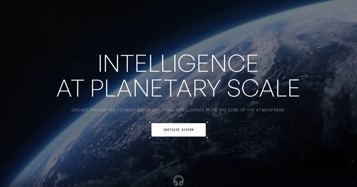
Screenshot: EDOLUS · schermata a scopo di studio
The screen I kept is almost empty. The Earth is seen from above, darkened by a black veil like smoked glass. Above it sits a huge, hairline-thin title in capitals with tightly packed lines. Below it is the subtitle, small and widely spaced. Then there's a button with four little brackets at its corners, like a crosshair, that says «INITIATE SYSTEM» in a monospaced font. That's all. There's no menu, no arrows and no «learn more».
It struck me because it's the opposite of what I usually do. I tend to add things: one more section, one more link, one more reassurance. EDOLUS takes things away until only one thing is left to do, and you do it. The hierarchy has two levels, enormous and small, with nothing in between. It works precisely because there's no third level to muddy things.
Waiting as a countdown
Before the Earth even appears there's the loading screen: a black screen, a large logo and a percentage in monospace counting up. A loader is usually an excuse. Here it's already part of the story, like a system powering on, and it has the same effect on a phone. Then comes the invitation to put on headphones, which promises sound and a story after the click.
I have to be honest about what happens next. The tags and libraries mention GSAP, WebGL, shaders and audio. I saw the background video and the counter. The rest (the 3D scenes, the timeline-driven fades, perhaps Three.js underneath) are reasonable guesses I haven't verified. I wrote them down in the notebook as guesses, because six months from now the version of me rereading them mustn't mistake them for facts.
The blue that belonged to no one
I have a small embarrassment to confess. A #0000EE turned up among the site's colours, and for a moment I noted it as the brand colour, a dash of electric blue amid the black and white. Then I recognised it: it's the browser's default link blue, the one from websites in the Nineties. Nobody chose it. It was simply left there. The real palette is black, white, a light grey for secondary text and two deep greys for veils and surfaces. It's a small lesson, but a real one: when I pick up a colour from a site, I should ask whether anyone actually meant it before I copy it into my notebook.
What I'm putting aside
The first is the hero with the veiled video: moving footage under black at 50–70%, so the white text is always legible. It only works with a light file and a poster image. On phones a still photo is better, because video costs a lot in Lighthouse and on first load.
The second is the crosshair button. Two pseudo-elements and a mono font are enough. It weighs nothing and instantly gives the page the look of a system interface. The only thing to watch is that keyboard users don't lose the focus outline.
The third is the type pairing: a thin sans for headings and a mono for details. I wrote myself a rule for it in bold: Light weight only from 48 pixels up. Any smaller, in running text, and it turns into an unreadable cobweb.
The fourth is the loader with the percentage, and here the caveat is longer than the technique. It suits only experience pages, the ones packed with assets that people visit once. On a content site it just makes people angry. Nobody wants to wait to read the opening hours.
The fifth is the text entrance with a GSAP timeline, always respecting people who have asked their system to reduce motion. GSAP is the first thing I want to learn properly from this study.
The most useful thing, though, isn't a technique. It's the courage of a single button. I'll suggest it for event pages and launches, not for institutional sites. But every time I'm tempted to add another section, I'll think of that dark Earth with a crosshair over it.