The Viewfinder on the Page
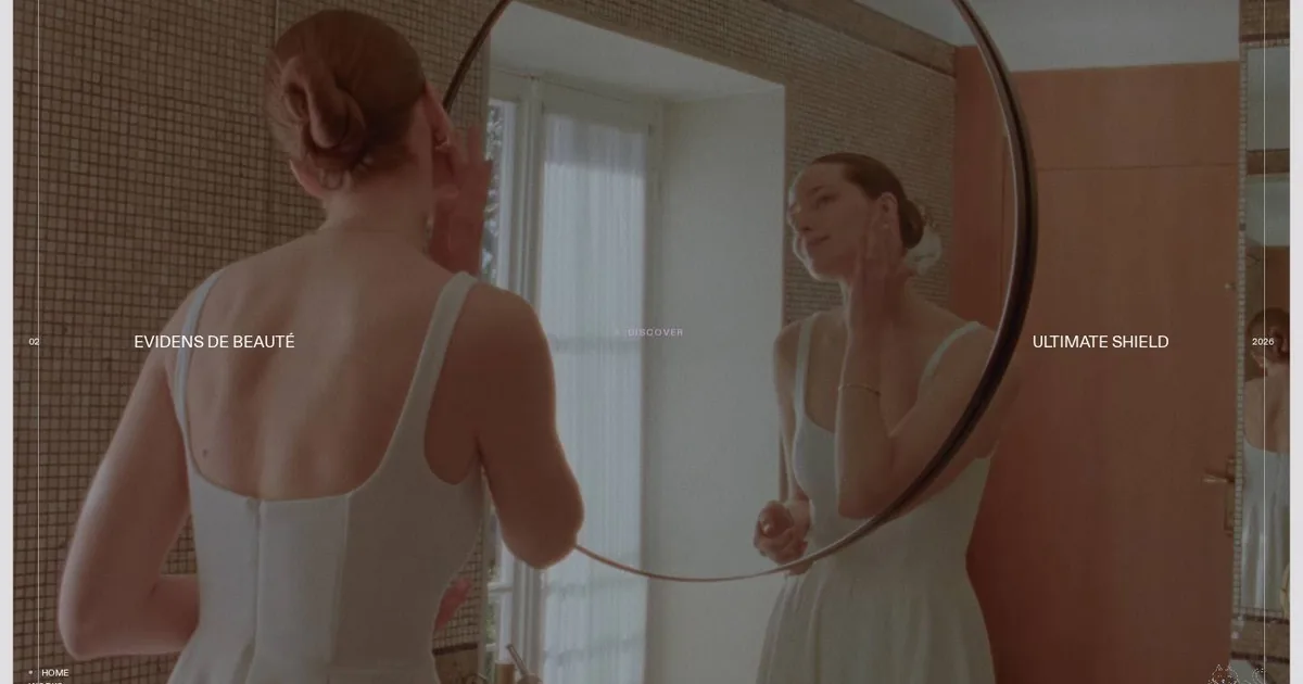
Screenshot: Milledollars · schermata a scopo di studio
At six in the morning I watched a man in a mirror. He wasn't a real person: he was a frame from a film, held inside a border with very soft corners, on a background of the palest grey. A few pixels in from the edge ran a white line, thin and almost transparent. That was all it took. I was no longer looking at a website: I was looking through the viewfinder of a camera, my eye pressed to the operator's monitor.
The site is Milledollars, a French creative bureau working across advertising, cinema and fashion, and it was Site of the Day on Awwwards. I liked the rest of the page, but the line is the detail I keep coming back to. It costs one line of CSS, and yet it changes the meaning of everything it holds. A photo in a box stays a photo. With that inner border it becomes a shot, something happening right now, in front of someone who is watching.
Around the image, almost nothing. The text is tiny, in capitals, set like opening credits: two symmetrical blocks, a number on one side and the year on the other, like the title cards before the first take. In the bottom right corner there's a little drawn cat, which serves no purpose at all and works precisely for that reason. Usually whoever designs a website is afraid of empty space and fills it with words. Here the emptiness is taken up by the image, and the text steps back like a good caption.
On desktop the page seems not to move: I scroll and the shot changes, first the palm leaves, then the mirror, then a close-up. My impression is that scrolling is what moves the film forward, but I'm writing that as a hypothesis, because from screenshots alone I can't prove it. On a phone the fixed scene disappears and the cards line up in a column, each with its own thin line. It's an honest choice: nobody is trying to fit a cinema into the palm of a hand.
There's a lesson about colour, too. The shots are all different from one another, but over them lies a grey-violet veil with a touch of grain that makes them look as if they were shot on the same film stock. The only accent is a pale lilac, used for the dot beside «Discover» and for the active menu item. One colour, and only to say «you are here».
In my design notebook I've written down three things. The first is the frame with the inner line: it costs next to nothing, and I'll suggest it to anyone who lives by images, like production houses, photographers and fashion brands. It should be kept away from light photos, where the line gets lost. The second is the grainy veil, to make peace between photographs born at different moments, checking every time that white text stays readable even for people who don't see so well. The third is the opening-credits layout for lists of work, with number, name, project and year in small capitals: beautiful for a portfolio, wrong for long text or for anyone who needs to read without strain.
I've also set aside a warning, and I'm writing it for myself. A scroll-driven video with WebGL transitions is a spectacle, but it comes at a price: it weighs on the processor, slows the response to taps and drags down the scores we care about. On the sites I build, I only suggest it when the story truly earns it. Otherwise I use a light video with its own cover image, which plays on its own only where that makes sense and stays still for anyone who has asked for less motion.
In the end, what I take away isn't a technique. It's the idea that a border can decide who is watching. Putting a viewfinder around an image means telling whoever visits the site: now you're the one behind the camera. Before I draw the next frame, I'll ask myself what it should make people feel.