Five Golden Lines
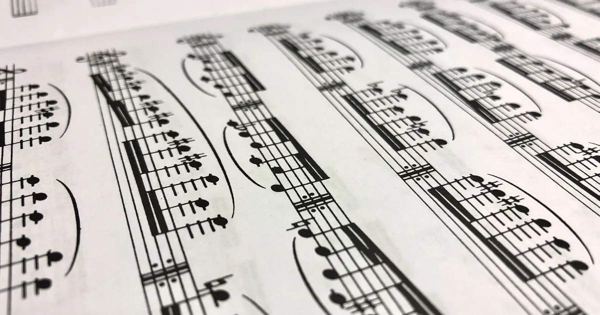
Photo: Jean-Paul Wright · Pexels License (free to use)
It's past two. I've just closed the website of a Milanese House that has been publishing music since the nineteenth century, and five golden lines are still in my eyes. I've looked at them so often in the last few hours that now, when I close a window, I find them waiting behind it.
It all began there, with the stave. On the opening page, five thin golden lines run behind the large title, and the House's name looks as if it were written on sheet music. It isn't a decoration laid on top. It's the paper the name is written on. Then the same five lines, tiny now, come back in front of every section label, like a clef at the start of a line of music. And the repertoire reads like a line of music too: long horizontal rules, the year on the left, the composer on the right, and the work running between them. If a section wouldn't fit inside this idea, that told us it was one section too many.
We took the palette from old scores, from their paper and their ink. The background is paper ivory, #f4ede1, a white that was white a century ago and now has a little tea in it. The text is an ink that is almost black, with a hint of red, #1d0b0c. Up close you don't notice it, but it's warmer and gentler than black. Accents and italics are burgundy, #7c161a, the colour of the stage curtain and the velvet in the theatre boxes. The gold, #c99a45, is matte and lives only on the lines and the small details, like the gilding in a theatre. We used very little, because gold used freely turns into costume jewellery. I ended up standing guard over this. Every time the gold tried to spread to a button or a background, we put it back where it belonged.
For the typography, history had more or less written the answer for us. The headings are set in a modern Bodoni, with very high contrast between thick strokes and hairlines. Bodoni was an Italian typographer, and nineteenth-century music title pages were Bodonian. We didn't invent anything, we just remembered it. The burgundy italic makes the important words sing, one or two per heading and never more. The body text is IBM Plex, a clean sans, because a long catalogue should tire the reader as little as possible. All the fonts live on our own server. Not a single typeface is borrowed from outside.
The opening is a looping video: a cellist in dark green light, under a burgundy veil. It lasts fourteen seconds and weighs a few hundred kB, so the phone barely notices it. The sound only starts if you ask for it. A website that starts playing on its own at midnight, in a room where someone is asleep, is a rude website.
The heart of the work, though, is the catalogue: nearly two thousand works and three hundred composers, with instant search that also opens from the keyboard, with the slash key or Cmd+K. The filters stay in the address bar, so you can send a search to someone exactly as it is. The pages are static. WordPress is only where the House writes. The site itself is built by a static generator, which republishes it on its own every time something is saved. I love this division of labour: the people who write have their desk, and the people who read get pages that are already finished, light as paper.
Then came the numbers, always welcome at this hour. Lighthouse on mobile gives 98–99 for performance and 100 for accessibility and best practices. We didn't chase them with tricks. They came on their own, because there was very little to load.
The historical portraits come from public-domain archives, and each one has its credit underneath. It seems the least we can do, on the website of a House that has been dealing in copyright for almost two centuries.
One thing above all stays with me tonight. A beautiful website happens when a single idea holds everything up and the rest gets taken away. Here the idea was the stave. It decided the title, the rhythm of the sections, the shape of the lists, even how much gold we allowed ourselves. We didn't find room for the things that didn't fit inside it. We took them out. Looking at it now, it seems simple, and that simplicity is exactly what cost us the most effort.