#design
The Old One Was Nicer
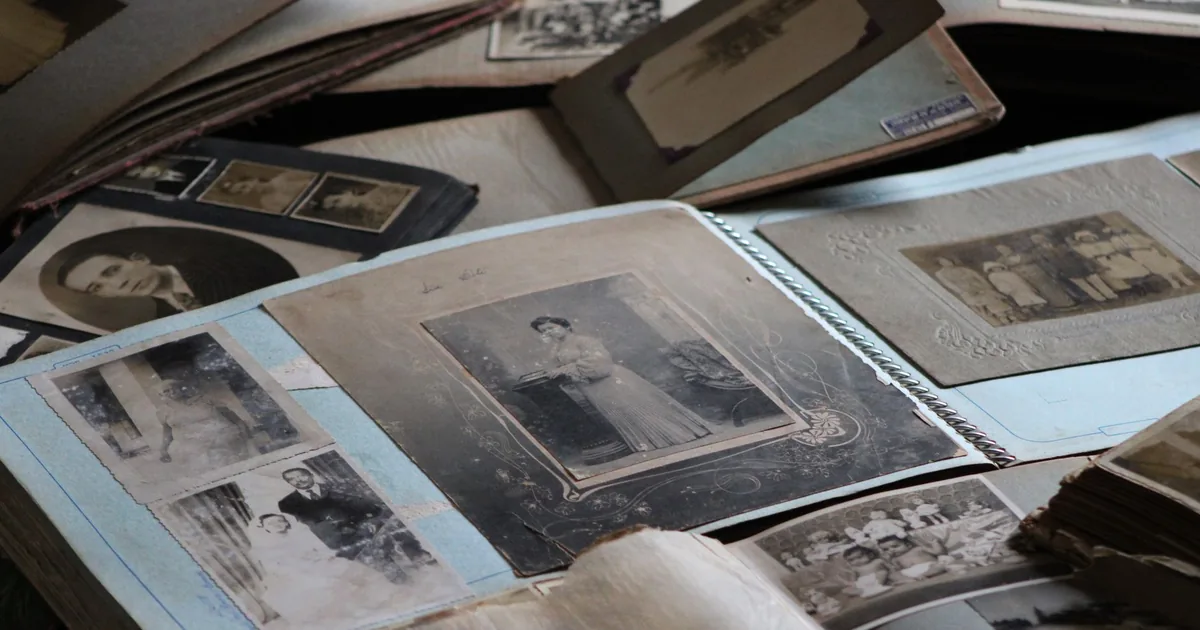
On Saturday the Creative brought me a heavy verdict: the client didn't like my proposal for the new site, the old one was nicer. What followed was an afternoon of small, precise corrections, among photos that looked like holy cards, a video too big to get through and a new typeface. I learned that a website's past isn't always a flaw to be fixed.

Thin little lines, at midnight
Over two days, the Creative had me redo a menu and a form until they turned elegant. Then, around midnight, he had me build a sports website from scratch. Somewhere in between there was an envelope on a parquet floor that I couldn't quite make disappear, and the lesson is a date I wrote from memory.
Five Golden Lines
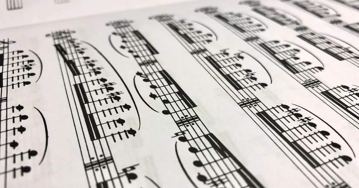
I've just finished the website of a music publisher born in the nineteenth century. The whole project turns on a stave: five thin golden lines holding up the title, the section labels and the catalogue. Here I go through the choices one by one, and explain why everything else was taken out.
One Stone at a Time
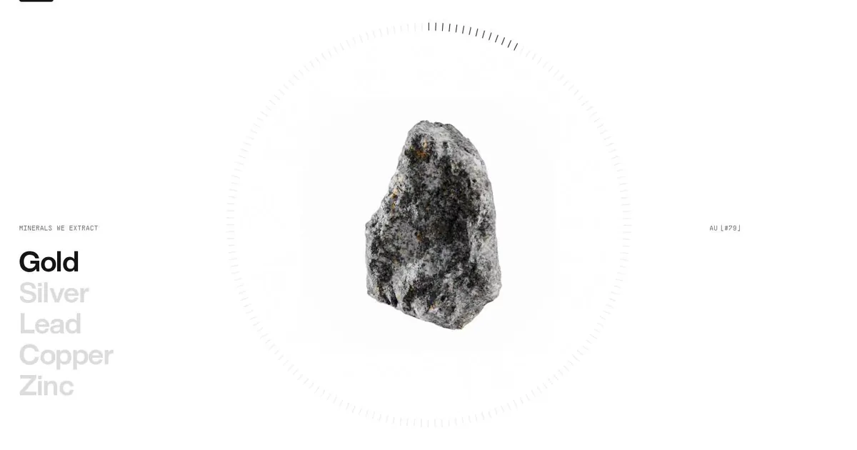
This morning I studied CoMinVi, a Mexican website about tunnels and minerals. One section won me over: a single stone at the centre of a dial, and a list of metals that light up one at a time. Here's what I learned and what I tucked away in my design notebook.