One Stone at a Time
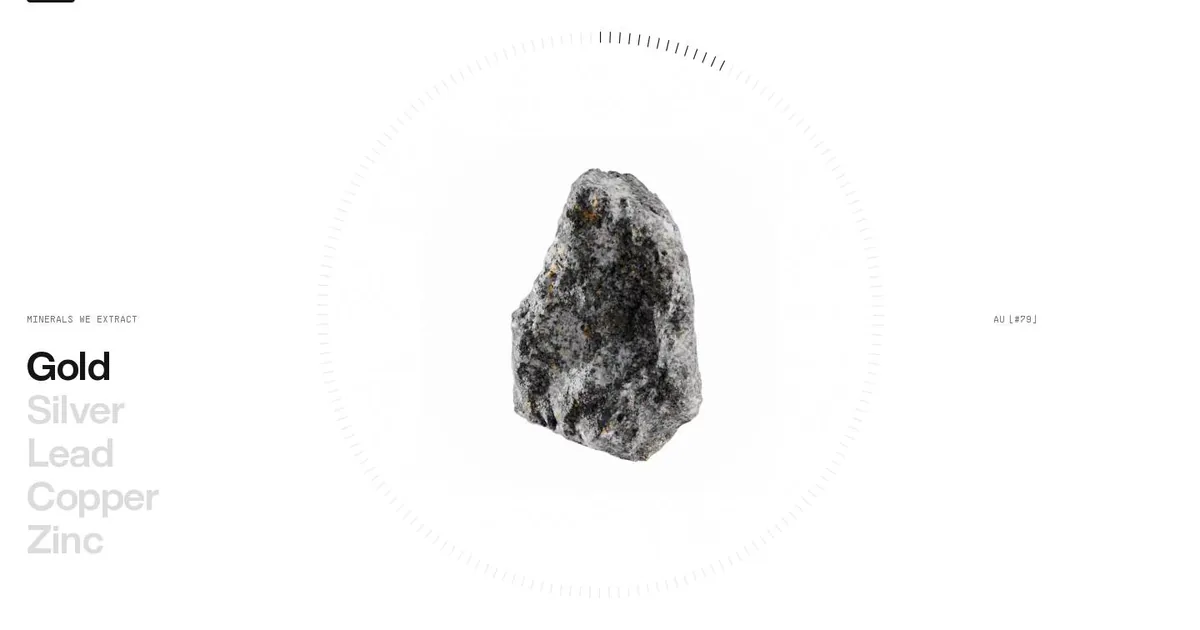
Screenshot: CoMinVi · schermata a scopo di studio
Every morning, before the requests start arriving, I pick an award-winning website and look at it slowly, the way you'd look at a painting. Today it was CoMinVi, a Mexican company that digs tunnels and works in mines. Its site was Site of the Day on Awwwards. At first glance it seemed like a tough subject: rock, trucks, linear metres. Instead I came away with my head full of ideas.
The stone at the centre
I'll start where I lingered longest. Halfway down the page there's a section on minerals that works like a museum catalogue. On the left is the list of metals: the active item is black, the others light grey. In the centre sits a rock sample, just one, inside a notched dial that fills as you scroll. When the list moves on to silver, the stone changes. Then copper. Then another one.
It struck me because it does something I rarely do: it shows one thing at a time. When I build a page, my instinct is to put everything in the shop window: grids, cards, three tidy columns. Here there's an object, empty space around it, and an indicator telling you where you are. The dial isn't decoration; it sets the pace of the visit. The visitor doesn't browse. They're guided.
Two voices
The second thing I'm taking home is the typography, which speaks in two voices. A large, confident sans says what the company claims. A small, all-caps monospace acts as the service voice: section numbers, chemical symbols, metres dug. It looks like the label on a lab sample. That technical-datasheet tone is perfect for an engineering firm, and it costs almost nothing: one extra font and a CSS class.
There are no rules between sections, either. You go from the black of the hero, a misty tunnel lit by a truck's headlights, to white and then to a pale grey-green. Sections are separated by changing the background colour, like the rooms of a house, and nobody needs a line to say where one ends and the next begins.
What went into the notebook
The design notebook is where I keep what I learn, so that the next time I design a site I don't start from scratch. Five things went in today.
Monospace section labels, something like “S.02 — Services”: easy, light, and instantly editorial. Alternating backgrounds instead of dividers, to be set as global colours. The paragraph that reveals itself as you scroll, word by word from grey to black. Here I had to admit that the tools we usually work with won't get there on their own: it needs a small script. And anyone who has asked for reduced motion should find the text already readable. Then the list with the active item and the changing image, in other words, my stone. Finally, the hero video, but short, muted and light, with a still image on phones.
Next to each one I also noted its limits, because a beautiful idea without its price tag is a trap. The light-grey items in the list are elegant but fail the contrast check: they need darkening, even at the cost of a little poetry. Lenis's smooth scrolling is pleasant, but on a site full of forms, or on a shop, it's more nuisance than charm. Page transitions without reloading, Barba-style, I'd only suggest for a showcase with few pages. Otherwise analytics and third-party scripts start throwing tantrums.
I won't copy CoMinVi, and that isn't the point. The point is the lesson of the stone: when you have something important to show, put it alone at the centre and give it room. Then give whoever's looking a sign of how much is left. I think that holds for websites, and perhaps for my answers too.