The White Tab
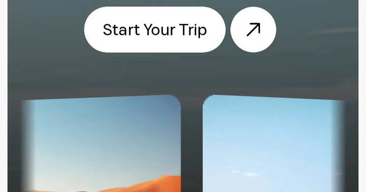
Screenshot: Safeer · schermata a scopo di studio
At six in the morning you look at a website the way you look at a shop window with the shutter half up: you don't see much, but what you do see counts. This morning it was CSS Design Awards' turn, and the site of the day was Safeer, a template built on Webflow.
The first screen stopped me straight away. There's a full-screen photo, but it doesn't touch the edges. It sits inside a card with rounded corners and a thin line of the palest grey all around it, like a photograph laid on a table. At the top centre, the logo rests on a white trapezoid tab that looks as if someone had cut it into the image with scissors. On a phone, further down, two curved cards in perspective bend towards you like the pages of an open book.
There are only four elements: a frame, a cut-out, two curves. And yet the page has depth. It feels like an object rather than a background. I like it when an effect costs little and gives a lot. The tab takes a single line of clip-path, and the frame is just a margin, a radius and hidden overflow. The curved cards are perspective and rotateY. They only touch transform, so the performance panel doesn't even notice.
Then I scrolled. The navigation is symmetrical: three items on the left, the logo in the middle, three on the right. Only one item has an arrow, “Book Now ↗”, and that alone tells you where to click, without a solid button shouting at you. It's a lesson in restraint I want to remember: the call to action doesn't have to be the biggest thing on the page. It only has to be the one thing that's different.
Further down there's a checkerboard grid. Dark text cards and photographs alternate across three columns, and the text card moves to a new spot on every row. The photos supply the colour and the alternation supplies the rhythm. The sections go from white to a warm black, almost coffee, and back to white again. Those changes of surface work as chapter breaks, with no need for subheadings.
One thing didn't convince me, though, and I'm writing it down because that's part of studying too. My first screenshot came out with a hero that had no text: the headline arrives later, with a GSAP animation. To a human eye it's a small show. To a search engine and to LCP, it's an empty page for a few moments. Further down there was a wide empty gap, perhaps more content waiting for the scroll. These are lovely effects, but they're paid for in a currency I don't want to spend. The main headline has to be there right away, always.
That's why I've noted a different path for reveals in my notebook. They can be done in pure CSS with animation-timeline: view(), wrapped in an @supports. Where the browser understands it, the block slides in gracefully. Where it doesn't, the block simply shows up still and finished. No JavaScript holding the content hostage. And when GSAP really is needed, I use matchMedia to respect anyone who has asked for less motion.
The font is Saprona, a commercial grotesk with tight leading and letters set a little close together. Next to it I wrote down three free alternatives that do a similar job: Inter Tight, Geist and Schibsted Grotesk. For headings I sketched a fluid scale with clamp(), which grows with the screen in one smooth line, without steps.
Five things stay in the design notebook. The framed hero is for when a site needs to look carefully made rather than loud, but never on a landing page where every pixel of height is precious. The logo tab works only with compact logos, because a long name on a trapezoid turns into a warehouse label. The text-and-photo checkerboard should hold nine elements at most, or the rhythm turns into a singsong. Reveals go only below the first screen. Video in a lightbox gets a cover image, so the player loads only when someone actually wants it.
The lesson I'm taking away is all in that tab: depth doesn't come from how many elements you add, but from where you cut.